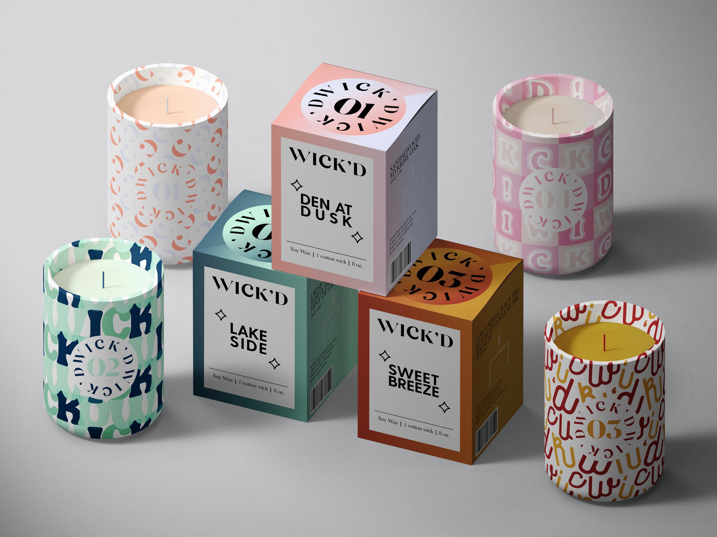
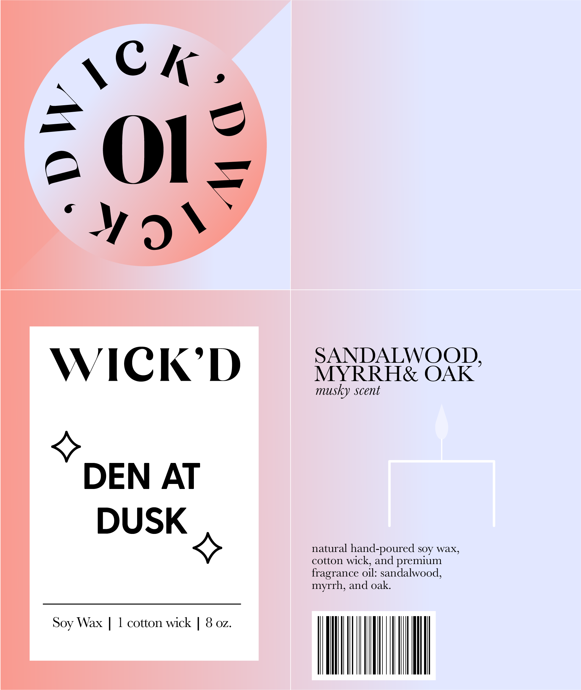
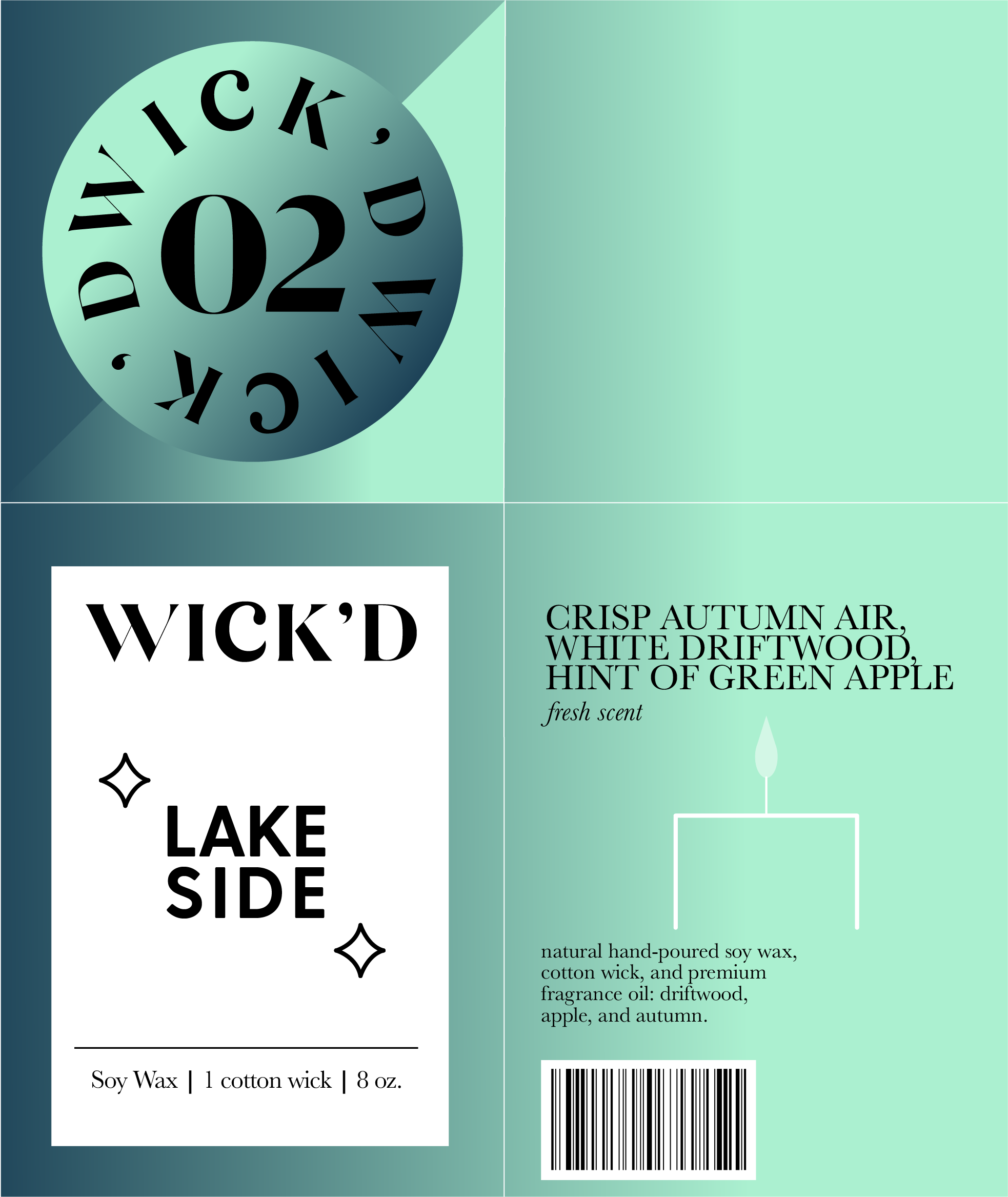
Typography based Package Design
This was an Honors project that I did for my Introduction to Typography class. I was tasked with coming up with a candle brand name and designing the packaging / product, as well as making multiple iterations of candle patterns. My main objective was to design the packaging with almost all type and limited non-typographic elements.
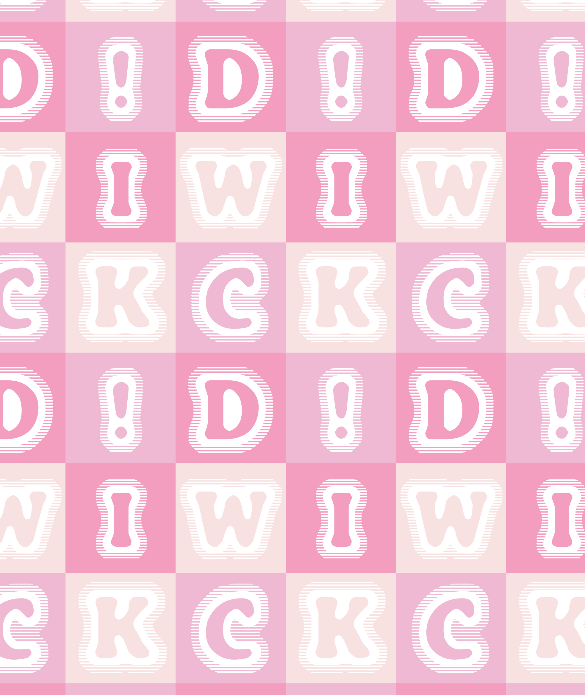
The brand name “WICK’D” is not meant to sound like wicked, but more like “whicked,” as it plays on the wick inside of the candles.